CSS: How it works and how to make it better - Part 1
Some background on CSS

CSS is weird! I’ll be honest. I’m not particularly fond of CSS. Or rather, I’m not particularly fond of the minutia. The actual usage of CSS. I find it frustrating.
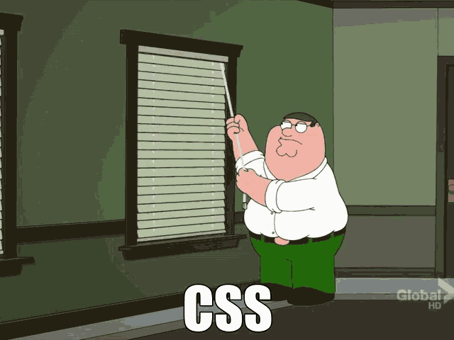
You probably saw the meme before but that is genuinely how I feel tweaking CSS properties.
When it comes to CSS, I like the backend of frontend.
That said, I do find something interesting about it. What the browser does with it and what I as an engineer can do with it to help out the browser. When it comes to CSS, I like the backend of frontend. I don’t enjoy using CSS but I enjoy looking at it and treating it as a resource to be managed, parcled out and piped in adequate amounts into the browser, ideally only when needed. So, let’s talk about that.
How the browser renders
I named this paragraph “what does the browser do with css” but I realised it’s pretty hard and not very useful to separate the CSS part. So, I’m writing about how the browser renders a web page instead 😀
That means going over it and using the DOM to build the DOM.
When we go to a website, what actually happens is our client talks to the server using HTTP requests. The “conversation” usually ends with the browser receiving an HTML document. I’m skipping over a lot; networking, headers, data formats, ISPs injecting ads into the server’s response, all very interesting subjects but the focus now is just the rendering.
The client now has an HTML document and it starts parsing it. That means going over it and using the DOM to build the DOM. Confused? So am I!
But there is reason to the madness. The DOM is both “a programming interface for web documents” and “a document with a logical tree”. Parsing is just the browser going over the document and, based on the tokens it sees, calling the DOM methods in order to build a DOM tree.
<!DOCTYPE html>
<html lang="en">
  <head>
    <title>Hello world - title</title>
  </head>
  <body>
    <div class="block">Hello world - body</div>
    <p>Lorem Ipsum</p>
  </body>
</html>
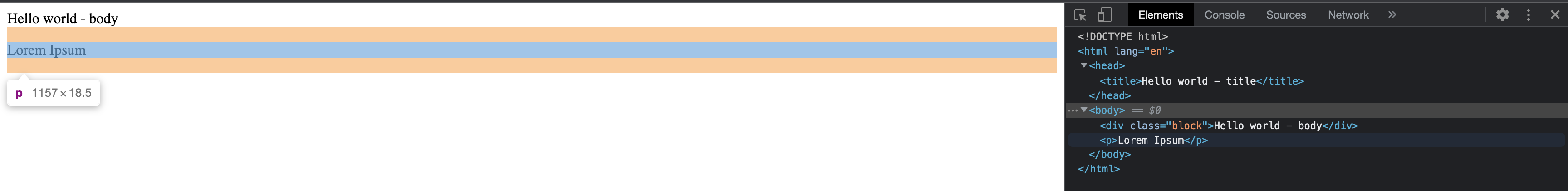
Let’s say the server gets back to us with this document ☝️
The browser will tokenize the input and for each token call appropriate methods. For example, the snippet above will have the head token, so the browser will create a HTMLHeadElement. We can check that out pretty easily. In any web console, just type in this:
document.querySelector('head') instanceof HTMLHeadElement
For our document, the DOM, as in tree, will look sort of like this.
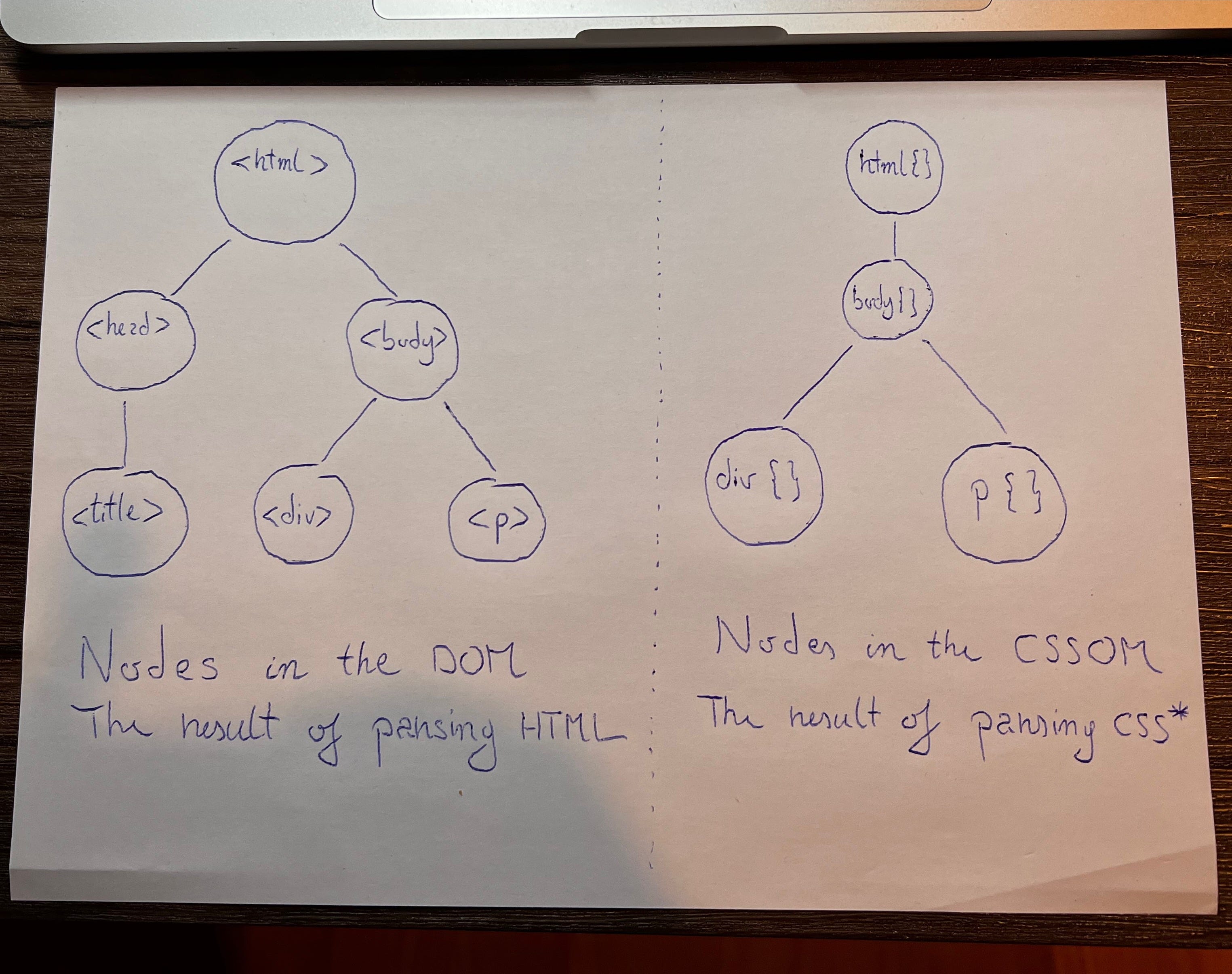
The DOM is the one on the left. With the DOM built, we have one half of what we need to render.
But, there is another tree there, the one on the right. That is the CSSOM, and it’s the second necessary tree for rendering.
With the original document, the CSSOM would actually only have the html and body styles. This is because we have not provided any styling in our document. As a result, the browser will use it’s user agent style sheets. Super simple CSS defaults essentially.
To get the CSSOM above, let’s change the document we get from the server to this.
<!DOCTYPE html>
<html lang="en">
  <head>
    <title>Hello world - title</title>
    <link rel="stylesheet" href="style.css">
  </head>
  <body>
    <div class="block">Hello world - body</div>
    <p>Lorem Ipsum</p>
  </body>
</html>
It’s the same as before with only one difference. We added a reference to a style sheet. The browser parses the document, sees a link, stops ( this is actually pretty important, CSS is a render blocking resource ), loads and parses the CSS and only after returns to parsing the original document.
Let’s say the style.css resource is this:
.block {
  color: blue;
}
body > p {
  display: none
}
There is going to be an html and body class from the user agent styles and a div and paragraph class from .block and body > p respectively. That is why we have a four node CSSOM.
The next step is to put those two together!

It’s fairly straight forward. What the browser will do is essentially the intersection of the DOM and CSSOM. It will apply the styles for each node and if a node is not visible, like body > p in our case, it will remove that node as well.
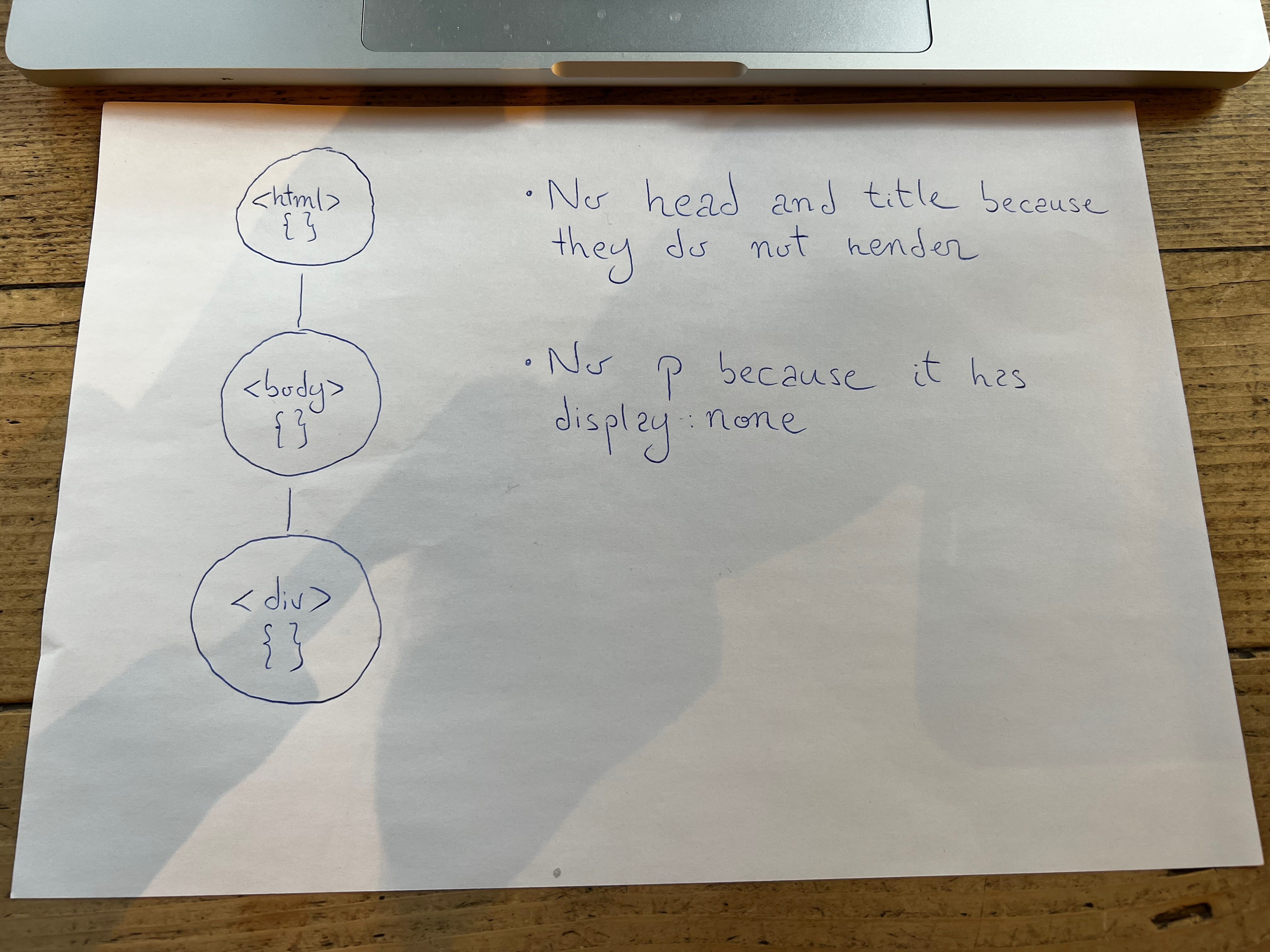
Now we have a render tree. The final steps are two operations performed by the browser. Layout and Painting. Layout deals with element positioning. What goes where, in what order, what size an element has. Paining, as the name suggests, is literally paining pixels on the screen. This entire saga I described is called the critical rendering path and it is how websites actually appear on users screen. It is also where bottlenecks happen and where software engineers can optimize many things in order to offer users a smooth experience, lower costs and increase the sites ranking in Google.
CSS problems that happen at scale
Hello World Inc is born and they start publishing Lorem Ipsum documents daily
Now we know a few things about how the browser renders. Let’s turn to what problems can happen, why and what we can do to fix them. For that, let’s immagine a scenario.
Let’s say the document I showed you above is a massive success. People just love Hello World and Lorem Ipsum. The people behind it decide to go big! Hello World Inc is born and they start publishing Lorem Ipsum documents daily, multiple times per day even. We’re not going to talk about architecture choices one must make when faced with the need to scale, although systems design is a great subject in of it’s self. We’re going to assume that problem is the best kind of problem: someone else's. We are simply going to focus on the CSS part.
At first, everything is fine. Yeah, the documents we’re serving now are entire paragraphs of Lorem Ipsum. That means extra DOM nodes for the browser to deal with. And because editors want some Lorem Ipsum emphasised, styles.css now looks like this.
body {
  color: black;
  font-size: 12px;
}
.headline {
  font-size: 16px;
}
.emphasis {
  font-weight: bold;
}
There’s a bit more complexity, for sure but nothing to warrant our attention. The sales team made a great contract to put some ads on the site, I’m sure they won’t massively impact load speeds, make the page feel janky by moving stuff around, hinder refactors by requiring specific classes or employ dark patterns to trick vulnerable users.
Hey, what could possibly go wrong?
The documents get a few new features, a more complex layout, images perhaps, quotes, different font colours for different sections, maybe some widgets thrown in there. Different devices need different styles, media queries abound now. This all means a lot of new CSS! The company is growing so it gets new developers on board. The pressure is on to get new features out, technical debt be damned! Some engineers try to use BEM but others don’t, !important gets tossed all over the place and accessibility is an afterthought at best. Our little styles.css file has by now grown into an unreadable monstrosity, a sort of text version of some lovecraftian horror.

To make things worse, the size of the file is starting to take a toll on the pages performance. But, that’s not even the worst of it. You remember all those engineers that were joining? Well, engineers come and go. And if Hello World Inc has a high churn rate, the devs coming in to replace the new ones will barely have any idea what their predecessors did. Out of fear of breaking existing functionality, some engineers develop cargo cult programming and instead of refactoring, they just pile on more CSS on top of the existing one. Hey, what could possibly go wrong? Everything! That new CSS they added, well, the devs think it works. They move the ticket to “ready for testing” and the QA picks it up. Turns out there’s some weird corner case, because of course there is with CSS. The ticket gets back. That one pointer that was supposed to be done by lunch time, it just turned into three points that will take a day, maybe a bit more. The backlog gets bogged down, dev times increase, more problems appear, performance is taking a hit. Something has to be done!
Right. The madness has to stop. We are going to use SASS to write our styles now. Imports, variables, nested rules, all this will help us better organise the style sheet. And the multitude of files resulting, we are going to manage and put together with gulp, the task runner.
The styles.css file is no more. What we have now is something more like this.
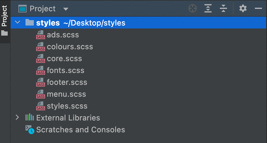
Instead of lumping everything together, we now separated things. Different engineers will have different opinions on how to organise code, it’s not the point at the moment. What matters is, instead of a thousand lines of unreadable css, we now how several, far more legible files.
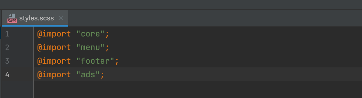
From the horror the initial styles.css was, all that is left is a spiritual successor, styles.scss, that merely serves as an entry point for the rest of the files.
The only annoying thing now is, every time we make a change we need to recompile our SASS files by running some command more or less like this:
sass src/styles.scss build/styles.cssWe need to make this part of our pipeline so, we’ll use gulp for that. We need a gulp file, something like this:
const gulp = require('gulp');
const sass = require('gulp-sass');

gulp.task('styles', () => gulp.src('styles/*.scss').pipe(gulp.dest('./dist/')));

gulp.task('default', gulp.series('styles'));
We tie the gulp command into our build script in package.json and thus we should now automatically build and copy the compiled scss to our dist.
We’re now in the point where we have an adequate organisation of our files. With SASS the styling is readable and we achieve some separation of concerns and with gulp we have woven SASS in our build pipeline.
We are left with a problem though. The compiled SASS files are still big, there’s still a lot of redundancy and web vitals could definitely be improved. We’ve still got some work cut out for us.
Follow me in part two where we explore what we can do about that!